I am Juan Real.
Product Design Manager at Miro
from Malaga (Spain)
based in Amsterdam.
Bio & passions
I am passionate about
designing user experiences
and interfaces...
...crafting vector illustrations sometimes...
...using tech as a medium for art expression...
...inviting my favourite bands
to play live in my hometown...
Canelaparty is a fancy dress music festival
created with my friends happening
every year since 2006.
...building products
with the user at the core...
...and enabling and facilitating
relationships and
conversations
I enjoy
solving problems
hacking
the solution...
How to create an engaging
presentation in a few days?
This site was built in a week using reveal.js which I haven't heard of before
How can you know
if the toilets are
occupied in ustwo?
By combining
an Arduino board,
Wi-fi connection,
3 Phillips HUE Lights...
...and a Mac OSX
Menu Bar App
How to do user testing
on a navigation mobile app
using geo-location
with no access to app code?
Combining in a Framer prototype
MapBox API to draw maps and
What3Words API to retrieve location data
How can you recreate BLACK
(analog b&w emulator mobile app)
as a Photoshop plugin?
By opening your favourite
Photoshop plugins
and reverse engineering.
What if I wanted to prototype
with a new technology?
With technologies I never used before: React Native & Augmented Reality
Providing a solution in the workshop facilitation space.
Under a tight deadline of 72 hours to complete the project.
IDE[AR]
A mobile app built using the cross-platform frameworks React Native and ViroReact that provide prompts to help in your next ideation workshop.
Talks
20-21 Jun 2023
"From ordinary to extraordinary: The future of creativity with AI tools"
As part of the AI in Web Design conf’23, the Geekle Group runs a 2 day event on how to supercharge productivity and creativity with Artificial Intelligence in UI/UX projects..
In this talk, as ONUT we shared our vision from the emerging field of AI for creativity. We explored the limitless potential of AI tools to revolutionize the creative process. To unlock new levels of imagination. Drawing on the latest insights from the field of AI for creativity. We delved into real-world examples. These showcase how AI is transforming the way we approach the creative field. Design, art, and other forms of creative expression.
- AI
- Web Design
- Creativity
2-3 June 2023
Lecture & workshop
SHAPESHIFT is a series of events exploring the relationship between humanity and innovation. Art, science, politics, curiosity and innovation shape and reshape the world we live in.
During our talk, we discussed how AI and other advanced technologies are transforming how we create & consume design + art. How we can leverage these tools to enhance our creative abilities and push the boundaries of human expression.
We facilitated a workshop. Through interactive exercises and discussions, we taught practical strategies for overcoming creative blocks, generating new ideas, and leveraging AI technologies to enhance your creativity.
- AI
- Creativity
- Art
- Activism
20 Oct 2022
Office hours:
Experience design
Invited by Latitud team/group as a mentor on Product Design. This is the last cohort of the year 2022: LF8 with 124 tech founders. Latitud's vision is to build world-class tech companies in Latin America.
Participated as a mentor in an office hour session, alongside Alix Martinez: Group Design Manager at Miro. We focused on the topic of Experience Design & had a conversation with 5 founders. We discussed relevant topics for their businesses and recommended the best scenarios. And solved their questions.
- startups
- product design
- ideation
founders factory africa
Building and scaling
startups in the
African continent
Built two new value propositions – Floatpays & Tripplo
Supporting four african startups to scale
Enabling product & design capabilities within the org
- Africa
- startups
- incubator
- accelerator
Venture Building
The startup incubator programme is lead by the Venture Design team. We are responsible to build new ventures from zero. We collaborate with corporate partners on Fintech (Standard Bank) and Healthcare (NetCare).
As Venture Designer, I am responsible of the end-to-end delivery of the program. From spotting focus areas to validate early concepts with real users and coach founders through the journey of building a business from scratch. During my time in FFA, I am involved in the inception of Floatpays.
Main responsibilities:
- Identify trends & opportunities
- Shape business & product strategy
- Test & validate experiments through user research
- Stakeholder management
- Workshop facilitation
- Product coaching
Venture Scaling
Within this programme FFA helps operating African startups to scale and grow their businesses. Each business partners with a full-team of specialists from FFA in: product, brand, growth, partnerships and investments.
Currently, I am leading support in product & design to four startups: Redbird, LocumBase, EnvisionIT and Akili Labs.
Main responsibilities:
- Define startup scale vision
- Shape business & product strategy
- Coaching in Product Development
- Roadmap & backlog planning
- Design wireframes, UI & prototypes
50% of middle income South Africans spend their salaries within 5 days of receiving them. Using 25% of their income settling previous debt.
Floatpays' mission is to help users achieve financial wellbeing through early access to their earned wages and assist with financial planning and budgeting.
This business was built as part of the Venture Building programme and I was involved assisting in product & design.
Main responsibilities:
- Shape business & product strategy
- Product Development
- Roadmap & backlog planning
- Product design in mobile, web & back-office

In South Africa, the matching between Locum and practices involves expensive fees and a lot of admin for practices. LocumBase solving these pain points by providing real-time availability with transparent pricing through verified locum medical professionals to practices, pharmacies, hospitals & clinics.
FFA collaborates with LocumBase within the Venture Scaling programme. I lead the FFA team as well as assisting with product & design.
Main responsibilities:
- Define & execute startup scale vision
- Coaching on Product Development
- Pilot planning & execution with corporate partners
- Roadmap & backlog planning
- Product design: wireframes, UI & prototypes
This startup from Ghana provides quick and accesible health monitoring to patients within pharmacies. Redbird partners with pharmacies to bring proven rapid test technology for chronic and acute conditions.
Redbird joined recently FFA Venture Scaling. I lead the FFA team as well as assisting with product & design. To help with recent pandemic events in Ghana and other African territories, we iterated their offering to deliver a mobile app for tracking Covid-19 symptoms.
Main responsibilities:
- Define & execute startup scale vision
- Coaching on Product Development
- Pilot planning & execution with corporate partners
- Roadmap & backlog planning
- Mobile product design: wireframes, UI & prototypes
IBM Africa Fintech Summit 2020
Founders Factory Africa partnered with IBM, Village Capital, Medici, Queen City Fintech and Microsoft 4 Africa in a demo day. 14 African startups in the Fintech space pitched their business and this was followed by coaching sessions.
As part of the agenda, I delivered a virtual collaborative workshop on how to build for Product Market Fit. We discussed the following areas:
- Problem-solution fit: Is there a problem worth solving? Is the right solution for the problem identified?
- Product-user fit: Are there users using the product currently?
- Product-pricing fit: Is the product or service cost balanced with customer/user expectations & needs?
We worked with each startup to understand their stage in the product-market fit journey.
Key learnings
- South Africa, Kenya, Nigeria & Ghana are leading the way in the African startup ecosystem
- In general the business that apply to FFA's model appear to be in an earlier stage if we compare Africa with western market
- There is a
strong opportunity space for innovation in Africa with raw talent waiting for the right support for success - Every product experiment should have a clear question to answer, it should be specific and should be measured to help with decision making
- Establishing a clear vision very early helps a startup navigate through difficult times
- Businesses with strong connections with their customers are better positioned to scale and grow
snapcraft.io
Helping publishers to
build and publish
software on the App
Store for Linux
Growing snaps installed from
5 million (2017) to 17.5 million (2018)
Doubling publisher base in 1 year
- open source
- linux
- app store
- data-driven
Canonical & snaps
- Canonical is behind ubuntu – the most famous Linux distribution
- Ubuntu runs everywhere: from fridges to drones to servers
- Estimated more than 1 billion installations in 2017
- Snaps packages software using container-based technology created in 2014
- Snaps run in 41 major Linux distributions – 90% of market share
Why snaps?
- Installing & publishing software across Linux distributions is complex
- Updates or removal require manual user input
- Always prone to security issues
Working on snapcraft.io
- Joined as UX Lead to improve the storefront experience
- London office included design & front-end teams
- Back-end teams globally distributed – 80% of Canonical
- 1-week roadmap alignment sessions every quarter for Leads
- People allocation & team capacities for 5 London teams
- Storefront roadmap aligned with 5 additional teams
- Regular contributors to Canonical's Design System – Vanilla
snapcraft.io team
- 1x UX Lead 👋
- 1x Back-end developer
- 2x Front-end developers
- 1x UX Designer
Main responsibilities
- Roadmap & backlog
- Stakeholder management
- Team resourcing & planning
- UX & UI
- Conduct & plan usability testing
GETTING IMMERSED
First-hand research
Python developers are one of the biggest dev communities publishing software in Linux. I joined a team from Canonical promoting snaps at Europython 2018 to understand their needs and wants. Over 4 days, I met nearly 150 Pythonistas in our booth (number tracked by stickers given away).
Most frequent topics discussed
- Installing snaps in your Linux distribution
- Getting started with snaps and the effort required
- Why snaps instead of other packaging systems
- Dependency management when releasing python applications
- Inconsistent software behaviour across Linux distributions
- Management and version release, i.e. handling failed updates
THE PROBLEM
Slow adoption of Snaps
Microsoft, Slack, Spotify and other software teams quickly adopted snaps and snapcraft.io to publish software in Linux. But more independent publishers were not adopting the technology at a similar pace.
On the other side, there was a big misconception that snaps were only a product valid for ubuntu installations and benefits were not clearly expressed.
The team challenge was to increase awareness and adoption of snaps.
~10k
number of publishers
in the platform
Less than 10%
of installed snaps on
non-ubuntu Linux distributions
3
Programming languages used to publish snaps
7 million
snaps installed
(end of 2017)
one year after
Improving the marketplace
With initiatives focused on publishers and installers, we saw a big push on numbers for the platform.
~10k → ~20k
number of publishers
in the platform
Less than 10% → 15%
of installed snaps on
non-ubuntu Linux distributions
3 → 12
Programming languages used to publish snaps
7 → 17.5 million
snaps installed
(end of 2018)
FIRST SNAP FLOW
Crafting the First Snap Flow
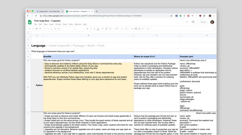
1. Quick content iteration
Used a spreadsheet to prototype the First Snap flow, creating a feedback loop with python devs to iterate the content.
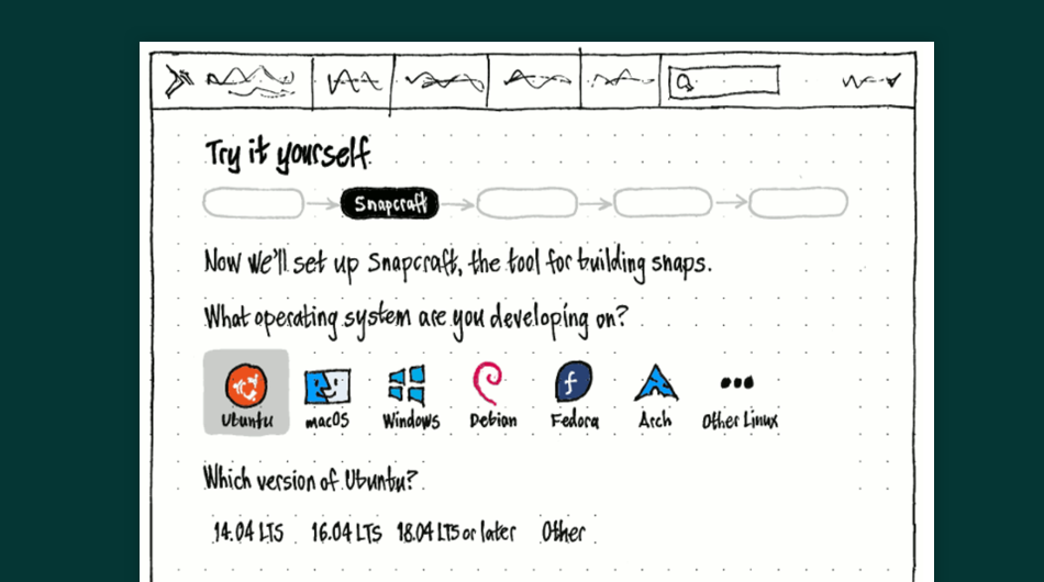
2. User flow & wireframes
Defined the user flow and started wireframing the spreadsheet content. This led to further iterations on the content.
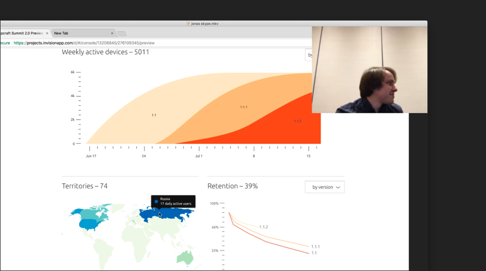
4. Testing with publishers
Presented the latest designs in a summit with snap publishers to get feedback on the First Snap Flow.
First Snap Flow
Using data to drive decisions
- Created a data dashboard early to capture user behaviour
- Included completion rate, drop-offs, churn rate, source and programming language related metrics
- Launched Python first and data helped on decision making for further languages
- Combined with user feedback captured from snapcraft summits
First Snap Flow
Key learnings
- Design metrics early to focus on user & product goals
- Find subject experts (e.g. Python devs) to create regular feedback loops
- Any tool, even spreadsheets, can be used to prototype an experience
- Using summits and events to connect with the audience
What would I have done differently?
- Challenge all storefront team to contribute to research
Distro pages
Snaps across Linux distributions
- Cross-distro solution but linked to ubuntu
- 90% market share of ubuntu on installs
- Snaps not enabled by default on all Linux distributions
Distro pages
Key learnings
- Linux distribution families share the same political games as Game of Thrones Great houses
- The importance of building the correct URL structure to match user search intent for organic search optimization
- Searching how to install popular software in Linux (i.e. install spotify debian) results in these pages on 1st page of results
What would I change?
- Engage a wider representation of cross-distro audiences for further customization
NOISE & ROLI PLAY Apps | ROLI.com
Helping creators
get started using
BLOCKS
Reducing customer returns of BLOCKS (20% to ~0%)
BLOCKS experience in Apple Stores worldwide
- music hardware
- mobile & desktop
- unboxing experience
Launching BLOCKS
ROLI was famous for the Seaboard, an award-winning reimagination of the keyboard using Bluetooth MIDI and a multi-expressive surface.
In October 2016 ROLI released BLOCKS (portable multi-expressive Bluetooth MIDI devices), NOISE (iOS music making app with BLOCKS support) and NOISE.fm (a platform for sharing your NOISE creations).
Why BLOCKS are different?
- Modular design
- Mobile music making device
- Affordable expressive MIDI controller
- Accessible for non-professionals & bedroom producers
Joining the band
I joined the team as Senior UX Designer in 2016 to work primarily on BLOCKS projects and updates to ROLI.com.
The team
- 1x Senior UX Designer 👋
- 1x Product Owner
- 3x Software engineers
- 2x Hardware Designers
- 2x UX Designers (2 months)
- 2x Visual designers (2 months)
Main responsibilities
- Roadmap & backlog
- Stakeholder management
- Lead external team (2 months)
- UX, UI & prototyping
- Conduct & plan usability testing
THE PROBLEM
BLOCKS launch performance
We notice the sales and performance of the product could be improved looking at some key metrics in the immediate months after launch
20%
product returns
on Lightpad Blocks
1.5x
time spent by
customer support on
setup compared to
other ROLI products
1.5 of 5
NOISE average rating
in App Store
60%
Hardware device registrations
THE RESULT
BLOCKS Performance over 1 year
Combined roadmap initiatives across our software and hardware teams helped us to improve metrics on BLOCKS from the launch.
20% → Less than 5%
product returns
on Lightpad Blocks
1.5x → 1.1x
time spent by
customer support on
setup compared to
other ROLI products
1.5 → 3.3 (of 5)
NOISE average rating
in App Store
60% → 90%
Hardware device registrations
Unclear unboxing instructions
Underserved
Lightpad Block
capabilities
Unpleasant 1st
NOISE experience
Unrelated NOISE
and BLOCKS interfaces
Bluetooth and
connection issues
Required previous
music making knowledge
From unclear unboxing instructions to
Streamlined unboxing experience
- Hardware, software & support roadmap alignemnt for improvements
- Launched roli.com/start for web-based product activation
- Included a new quick start guide on packaging
- Updated support and how-to guides on ROLI.com
Achievements
- Increased hardware registations to 90%
- Reduced manufacturing costs on printing & translation per unit
- Lower volume of support queries related to unboxing
From unpleasant 1st NOISE experience to
Hand-holding creators on first run
- Created a help feature across the app with callouts
- Dedicated onboarding for BLOCKS users
- Added explanation of the whole BLOCKS ecosystem
- Clear reasoning for account creation
Achievements
- Increased hardware registations to 90%
- Reduced customer support queries on NOISE & BLOCKS setup
- Customer support queries to 1:1 ratio compared to other ROLI products
From unrelated NOISE & BLOCKS interfaces to
Unified hardware & software interface
- Improved colour and text on NOISE for better accessibility
- Included navigation with sign posting
- Aligned interaction between hardware & software (e.g. swipe to change instruments, loop creation...)
Achievements
- NOISE App rating from 1.5 to 3.3 in 6 months
- Decreased volume of support queries related to NOISE & BLOCKS
From Bluetooth & connection issues to
Improved Bluetooth & device setup
- Anticipate connection issues with messaging
- Added step by step device setup on onboarding
- Created a new feature to control BLOCKS within NOISE
- Improved Bluetooth reliability through firmware updates
Achievements
- Increased firmware updates on BLOCKS from 30% to 70%
- Reduced queries on bluetooth & device connection
From Underserved Lightpad Block capabilities to
Learn to use BLOCKS in Apple Stores
- Designed a bespoke in-store experience for learning to play BLOCKS
- Learn about BLOCKS and created a short musical loop in 1 minute
- Gathered user feedback visiting Apple Stores to gather insights
Achievements
- BLOCKS available to purchase in Apple Stores
From requiring previous music making knowledge to
A beginner experience: ROLI PLAY
From our research with BLOCKS, limited musical knowledge could be a barrier to understand the BLOCKS proposition on expression.
ROLI PLAY allowed you to create a shareable short musical piece in minutes after unboxing the Lightpad Block. We stripped down all details that made NOISE complicated for beginners by creating a Lightpad Block companion onboarding experience.
- Selecting the most expressive sounds
- Pre-selecting instruments combinations based on genre selection
- Created lesssons on BLOCKS expressive capabilities
- Only allowing pre-determined scales to perform with the BLOCK
Key learnings
- Working on physical and online products requires creativity and continuous iteration
- Operational costs are key when developing hardware: translation, material costs, customer service...
- Bluetooth implementation vary per platform and assume zero knowledge on it from consumers
- Hardware and software play completely different time scales and processes but coordination is possible with effort
Tfl Accelerate Android App
Enabling a 2-way relationship
between TfL and passengers
using their active and
passive data
Innovation project funded by InnovateUK

- data privacy & governance
- transport APIs
- android
Working with TfL
TfL Innovation asked ustwo to help with their idea for a customer reporting app which lead to TfL Accelerate. This project was granted from Innovate UK and included as well TransportAPI as data governance experts.
With TfL Accelerate, users could report events to TfL and be updated on its progress. The location data generated by users, aggregated and anonymised, became an additional data stream for TfL to analyse.
The TfL Accelerate team:
- 1x Product Lead 👋
- 1x Product Owner
- 1x Android developer
- 1x Visual designer
Main responsibilities:
- Wireframes, UI and prototypes
- Manage product backlog
- Conduct usability testing
- Report updates to InnovateUK
The process in a nutshell
Our assumptions from performing customer interviews, reading TfL documentation and mapping the current reporting journey consolidated into one hypothesis:
Customers are willing to provide their data, actively or passively, if it improves TfL's network and services.
This hypothesis informed a prototype validated with 10 participants which led to develop TfL Accelerate over the coming 12 months. TfL Accelerate was developed as an Android app. A platform providing TfL easier consumption and analysis of the data generated.
During the Product Development, we had regular user testing sessions every 2 weeks with 3-5 participants. Additionally to this, we also organised two focus groups to understand users' perception of TfL Accelerate.
Outcomes
TfL Accelerate concluded with a 2-week trial with 200 TfL employees which generated around 500 unique customer reports. Trial participants kept using the app to generate reports to TfL after the trial finished.
The anonymised location data helped to identify TfL assets and infrastructure for further analysis. TfL Accelerate gave absolute control to users of their location data generated.
Key learnings
- Be conscious about how user data is manipulated by establishing a clear data governance
- Perform user testing on-the-go for more contextual outcomes on navigation / transportation apps
- Think holistically on all implications a digital product might have in a big service like TfL
- Experience leading and manage a government grant-funded project with explicit deadlines and milestones
Child Safety App & Browser
Providing parents
and their children
a safe experience
using the hudl.2
1.5 million units in 6 months
Average ⭐⭐⭐⭐ rating
Senior Interaction Designer (Jun 2014 - Oct 2014)

- parental control app
- bespoke browser
- android
- children user testing
Making parental controls work
I joined the ustwo team working with Tesco to deliver the hudl2, an Android Tablet from Tesco with bespoke OS and exclusive software.
Child Safety App and Browser is a parental control solution to manage the usage of hudl2 by children. Parents could also decide which web content and apps children could acces on the hudl2.
The Child Safety team:
- 1x Senior Interaction Designer 👋
- 1x Product Owner
- 3x Android developers
- 2x QA Tester
Key responsibilities:
- Wireframes, UI and prototypes
- Workshop facilitation
- Conduct usability testing
- Create hudl2 design patterns
Learning from the first hudl
The first hudl sold 750.000 units in 2013. A popular tablet among young families due to its affordable price with half of its users being children.
We learned from extensive user research and data, ahead of releasing the next version. The Tesco team generated 200+ product ideas which crystalised into four different products:
hudl2 product propositions:
- Get Started – To teach how to set up and use the hudl2
- Top Apps – A curated app store experience for hudl2 users
- Child Safety App – To help parents control and monitor how children use the hudl2
- Child Safety Browser – A browser for children managed by the Child Safety App based in Mozilla Firefox
Some process highlights
When I joined the Child Safety team, we built the product backlog by story mapping the product. All teams had user testing sessions every month to guide us through the Product Development. Other highlights:
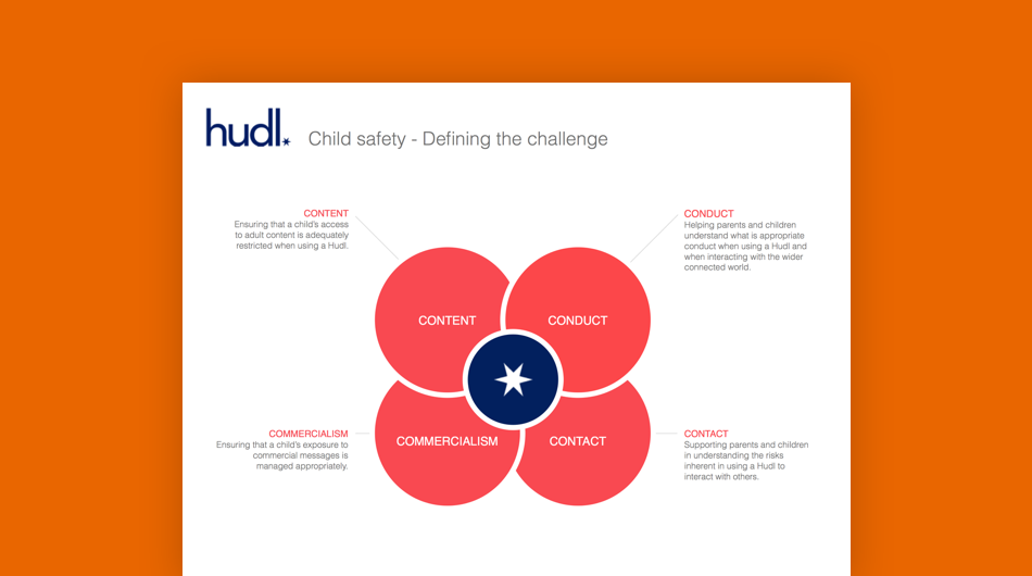
1. Experience principles
Established across all hudl2 products for a cohesive experience and guide the team during the product development.
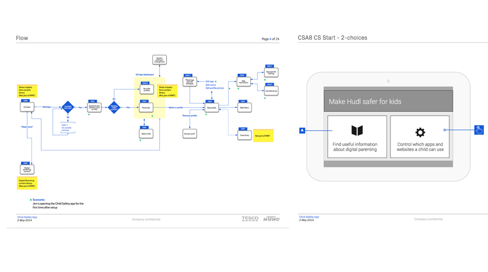
2. User flows & wireframes
We created user flows to cover the different use cases and scenarios. This informed wireframes afterwards.

3. Content creation
We collaborated with Parent Zone (experts in digital parenting) to create the content and tone of voice.
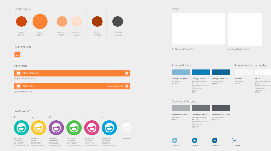
4. App map & Sprite sheet
Each product shared their own to build consistent branding & end-user experience.
Sharing is caring
We used a Photoshop plug-in called Ink to share design specifications with developers (This was 2012 long before Zeplin was available). Only supported Pixel units and transforming to DP units added some time on top of sharing the spec.
I decided to reverse-engineer the plug-in (inside is a zipped folder) and alter the code to use DP units. Saving a few hours every week to all hudl2 designers and developers.
I shared the code with the Ink plug-in developer. A few months later the plug-in included support for DP units.
Outcomes
Tesco launched the hudl2 in Q3 2014 selling more than 1.5 million units in less than 1 year doubling numbers from its predecessor.
The hudl2 was received with acclaimed reviews from The Guardian, Engadget or Trusted Reviews which highlighted the hudl2 parental controls for being simple, accessible and safe to use.
Key learnings
- Sketching with the team to achieve shared understanding
- Validate every single interface control with the core audience
- Always look for improvements on the process regardless of size
- The importance of onboarding and signposting users
- Adapt the user testing session to its participants (e.g. children, families...)
W3W mobile experience
Helping people
communicate a location
in just three words
4-week design and development programme
Product Lead (Aug 2016 - Sep 2016)

- geoencoding
- iOS & android
- rapid delivery
Uplifting what3words mobile app
What3words has divided the entire world in a grid of 3x3 meter squares. Each square is coded with a unique combination of three words. A coding system for location more human-friendly compared to GPS coordinates or any other alternative coding systems.
What3words engaged with ustwo to improve the mobile experience on their iOS & Android apps. This project expanded for 4 weeks.
I worked as Product Lead with another Visual Designer. Responsible for engaging with stakholders, workshop facilitation, UX/UI design, prototyping and conduct user testing sessions.
How we did it
We started with alignment workshops with key stakeholders, user testing sessions with what3words' mobile app (5 participants) and a what3words app heuristic evaluation.
Findings:
- Lack of connection between 3 words and location pin
- Strong similarity with Google Maps
- Unnecessary map controls not relevant for the interface
- Hard to share location
Our recommendation
A couple of iterations later we iterated on the branding, reduced controls on screen and streamlined the sharing journey. I prototyped this new version in Framer, using What3Words API and Mapbox API to mimic the real experience.
We tested this prototype with the original version of the mobile app with 5 participants. These concepts were highlighted by participants as more distinctive, functional and easier to use than the current mobile version of what3words.
We handed over our work to another agency for the development of the what3words mobile app currently available in the Apple Store and Google Play Store.
Barclaycard Tablet App
Prototype and visualise
the existing mobile app
experience for tablets
Senior Interaction Designer (Dec 2014)

- fintech
- concepting
- ipad only
Translating mobile to tablet
I joined the ustwo Barclaycard team as Senior Interaction Designer. Responsible for UX/UI design, prototyping, user testing analysis and workshop facilitation.
Barclays wanted to conceptualise how to translate their current mobile app experience to Tablet, understand the appetite from users for a tablet experience and identify the features expected for this new form factor.
The team:
- 1x Lead UX Designer
- 1x Senior Interaction Designer 👋
- 2x Visual Designers
- 1x UI developer
Analysing the mobile experience
We started the project by performing the following activities:
- Experience map of the Barclaycard mobile app experience
- Analysis of Barclays research documentation on mobile use cases
- Survey on credit card users needs and expectactions for mobile and tablet offerings
Defining key journeys
We compiled all our assumptions, defined the key user journeys for the tablet experience and filtered assumptions to two different hypotheses. Each one translated to a concept to test against credit card users.
Performing guerrilla user testing with 5 ustwo employees around the two concepts, we choose one to develop further. This concept was based on giving control to users around their finances by setting budgets, goals and notifying them.
Our recommendation
To validate the concept at the end of the project, we ran an user testing session (10 participants) with Barclays' official user testing partner: Seren. With the insights from the testing and our learnings from the project, we produced a document outlining our recommendation to Barclays:
The cost & effort to deliver a bespoke tablet app might not generate an immediate benefit for either users or Barclays.
Key reasons against a bespoke tablet app:
- Tablet sales and market was slowing down
- Banking was not a popular activity on tablet
- Expected feature parity from users between mobile & tablet apps
As of today, the tablet app for Barclaycard is a scaled up version of the mobile version for iOS & Android.
EXPLORE EOS INTERACTIVE IPAD MAGAZINE
Teaching digitally
how to use the
Canon EOS system
in a simple manner
1st Canon iOS app launched in Apple Store

- ipad magazine
- photography learning
Teaching photography basics
Whilst working at POSSIBLE, I joined the team for Canon EOS Explore, the 1st official Canon app on Apple and Google Play stores. An interactive magazine iPad app teaching photography concepts and how to use the Canon DSLR system: EOS.
Over 2 months we worked on interactive ways to teach basic photography concepts and relevant content about Canon and the EOS system. I performed guerrilla user testing sessions with POSSIBLE employees to guide the team during the product development.
Canon EOS Explore team:
- 1x Senior UX Consultant 👋
- 1x Product Owner
- 1x Visual Designer
- 1x Copywriter
Key responsibilities:
- Wireframes, UI and prototypes
- Conduct user testing
- Workshop facilitation
- Stakeholder management

RESPONSIVE GAMING HTML5 TEMPLATES
Building a responsive
experience for
mobile, tablet and
desktop gaming
1st responsive web solution for this market
- responsive web
- html5
Moving popular titles to mobile
Back in 2012, mobile gaming started to become popular and bwin.party decided it was their time to get into this new medium.
I was responsible for creating the template system to port the most popular game titles to mobile and tablet devices using web technologies.
bwin.party team:
- 1x Senior UX Designer 👋
- 2x Game Artists
- 2x Front-end developers
- 1x Game Mathematician
Key responsibilities:
- Wireframes, UI and prototypes
- Workshop facilitation
- Stakeholder management

